Regular block quote.
Every page should have only one Primary Large button. Remaining large buttons should be secondary.
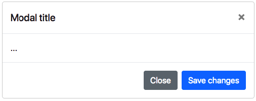
Use Primary Large button only for most important action on the page
Every page should have only one Primary Large button. Remaining large buttons should be secondary.
Use Primary Large button only for most important action on the page
Every page should have only one Primary Large button. Remaining large buttons should be secondary.